PINK SKIES TOUR BRANDING
PINK SKIES “FOREVER” ALBUM RELEASE SHOW
BRIEF: CREATE A TOUR POSTER AND BLANK FOR VENUES, AS WELL AS MERCH DESIGN
PRELIMINARY SKETCHES
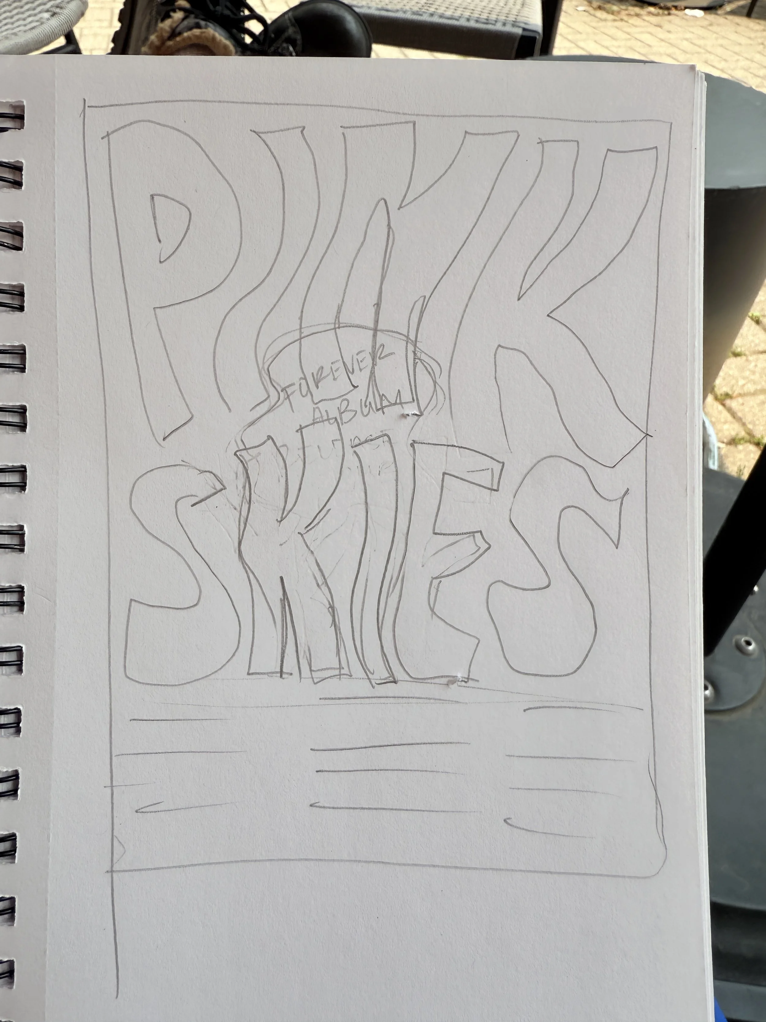

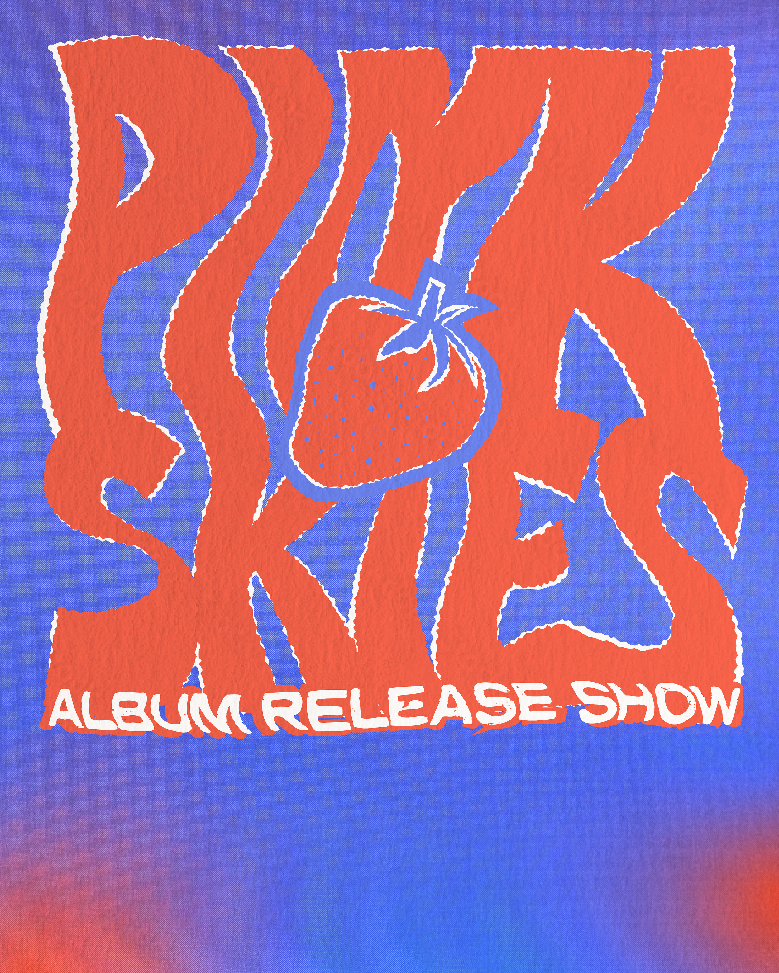
They wanted the tour poster and branding to be psychedelic, but also retro, americana tinted – Grateful Dead, Dazed & Confused, 70’s psych rock feel. From this inspiration, I knew I wanted to create a poster that was bold, fun, and felt like summer, especially since the music has a very summery, beach vibe feel to it. I started playing around with large, funky lettering and typography to find a more bold feel.
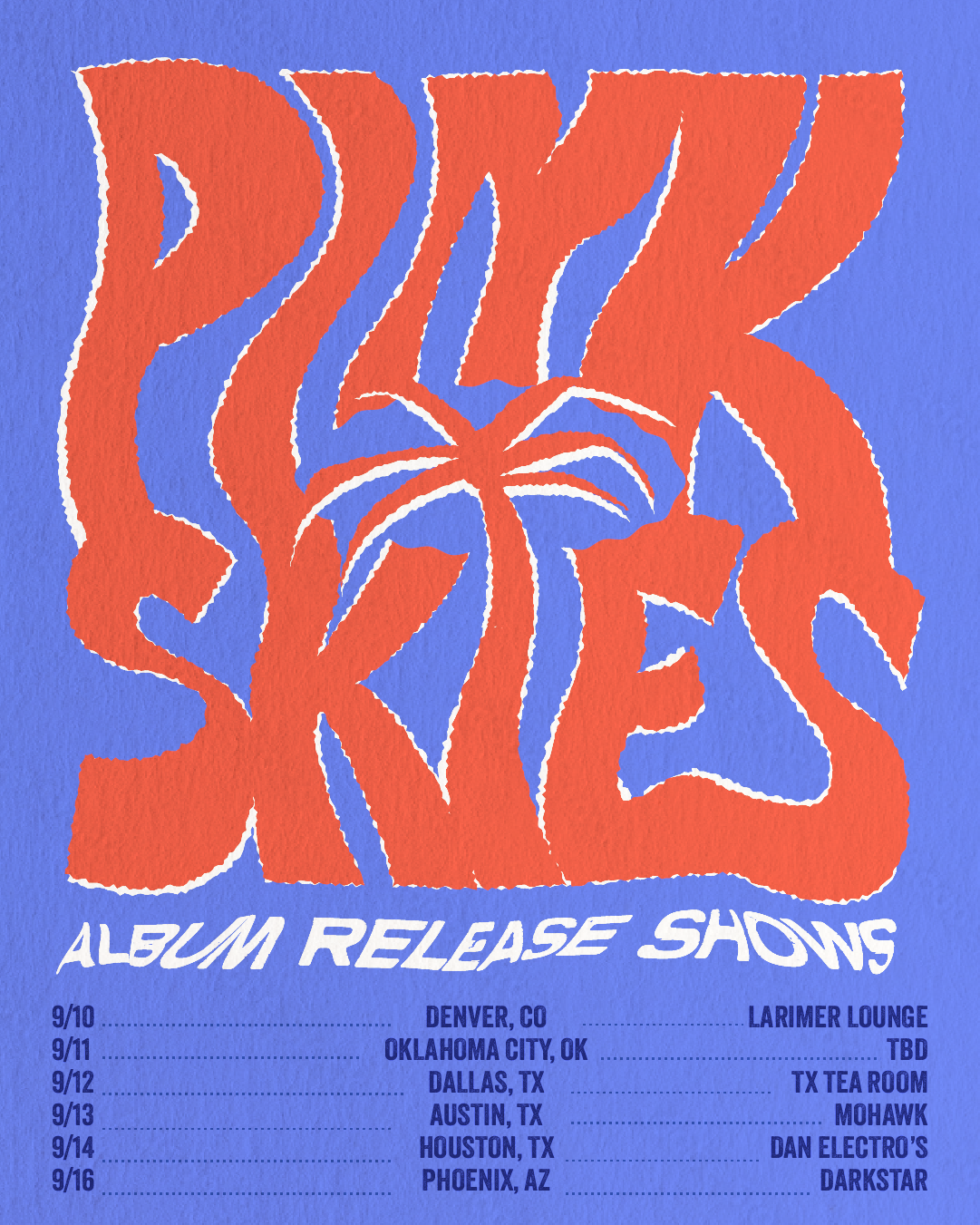
DRAFTS
I played around with different layouts and colorways. Once I landed on the majority of the design, I worked with the band to decide on an icon for tour branding. They were set on a fruit, so we tested out a few different ones before choosing the strawberry.

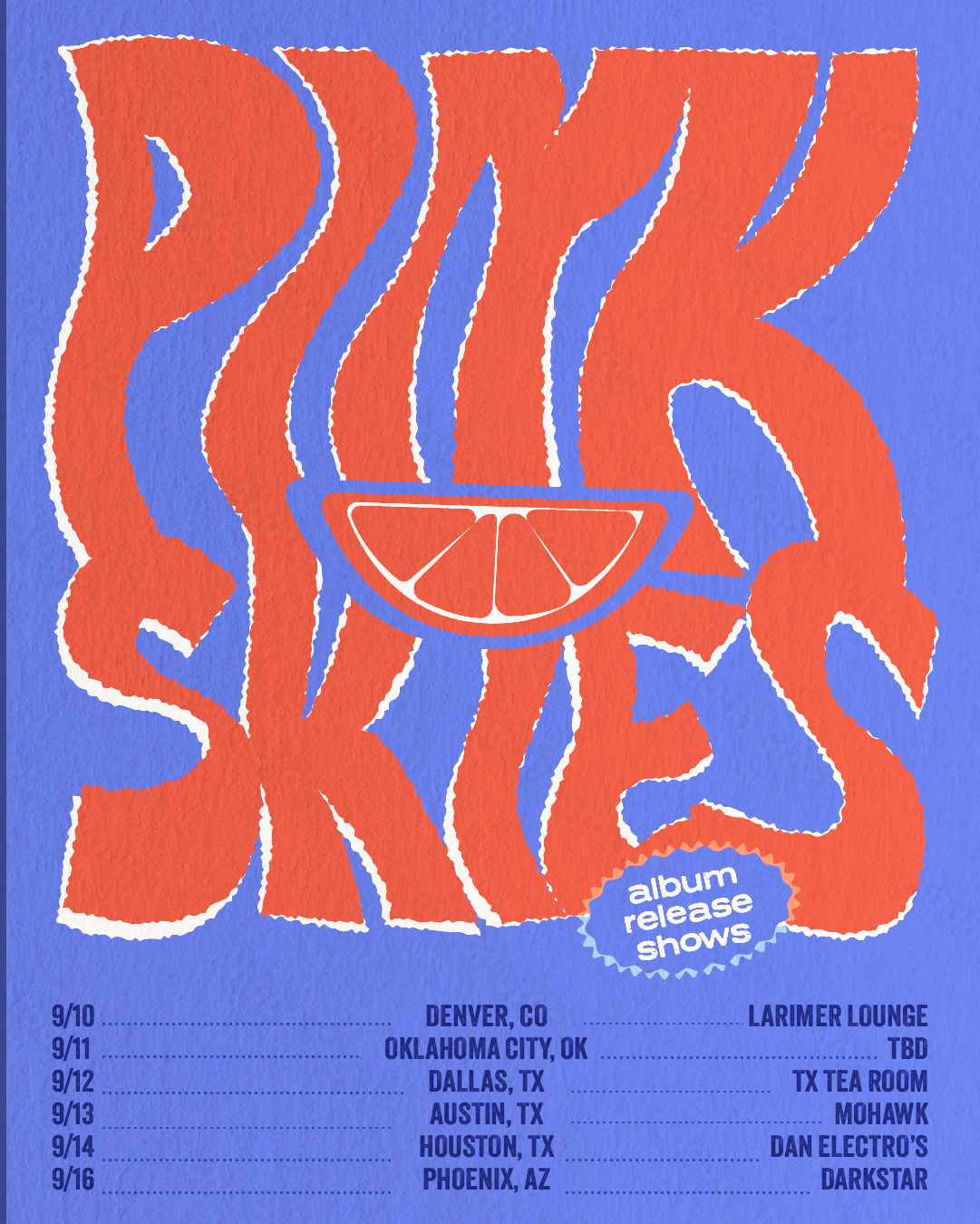
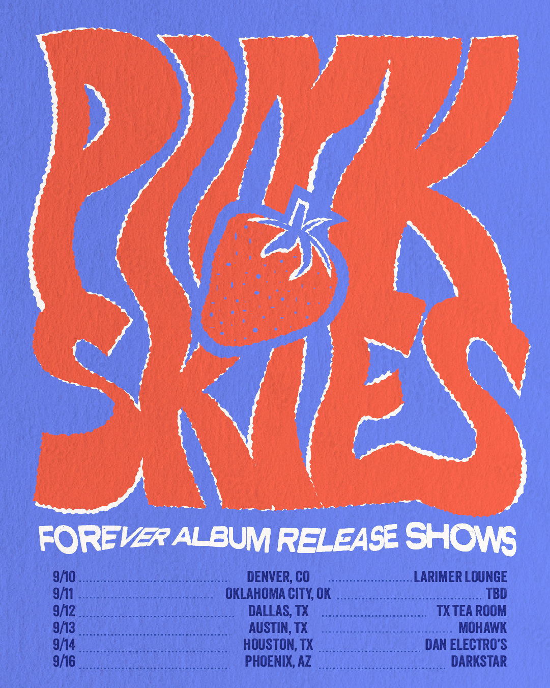
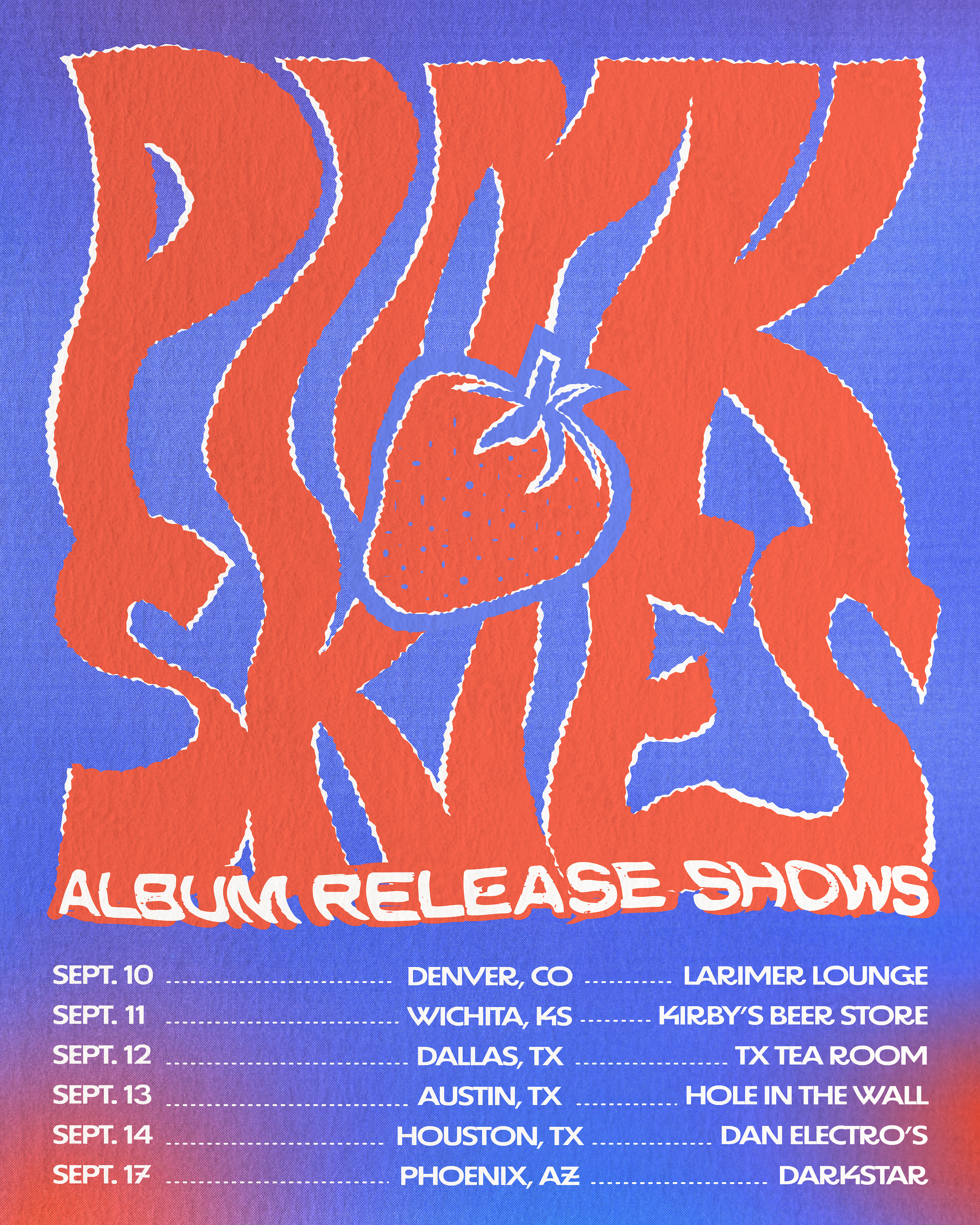
FINAL POSTER
THIS INCLUDED 2 VERSIONS, ONE WITH “ALBUM RELEASE SHOWS” AND ONE BLANK WITHOUT THE TOUR DATES
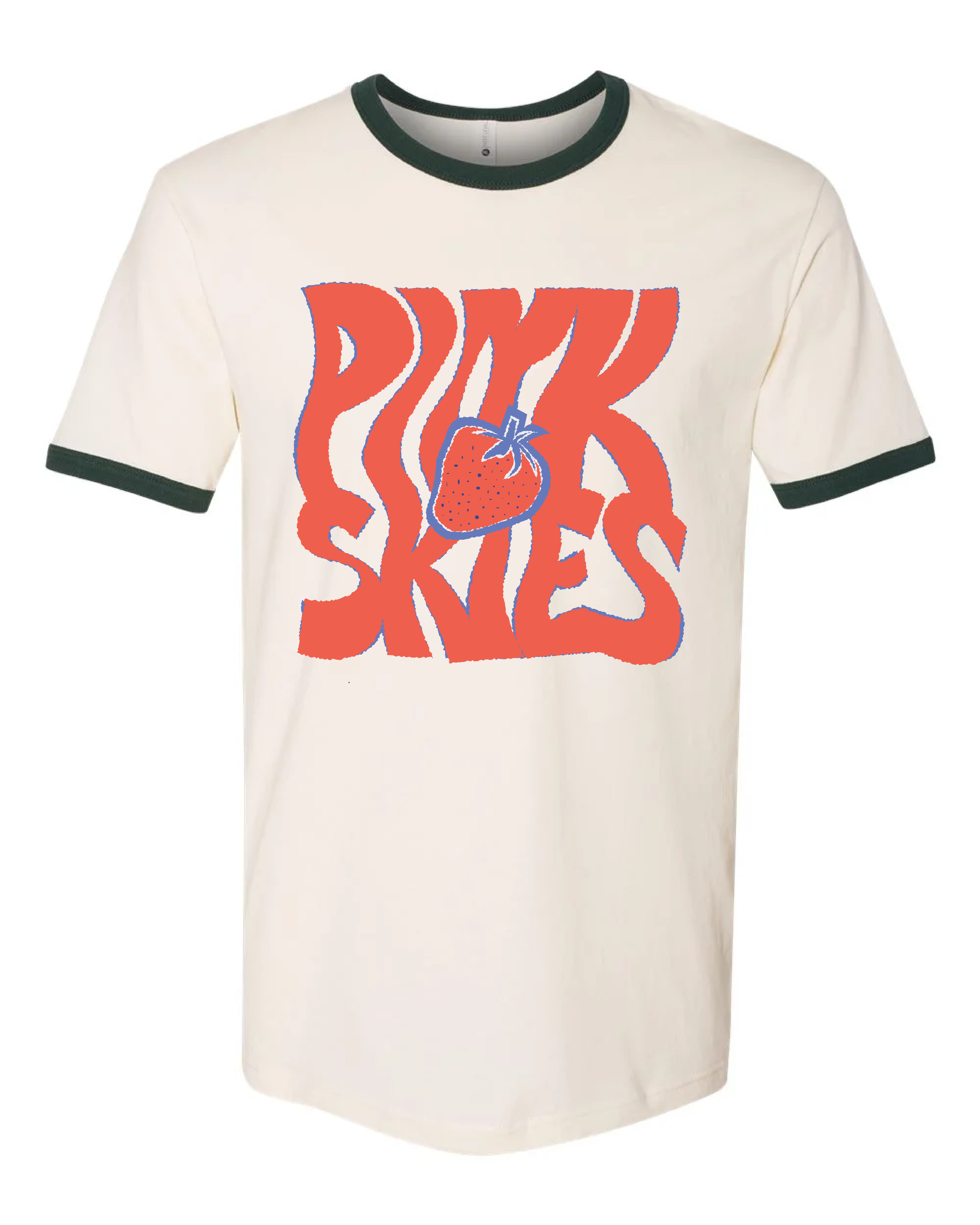
MERCH DESIGN
Once the posters were completed, they asked me to make a corresponding design for a tshirt to sell at the shows. We tested out many options: front vs back of shirt, shirt colors, and how complex vs simple to make the design.


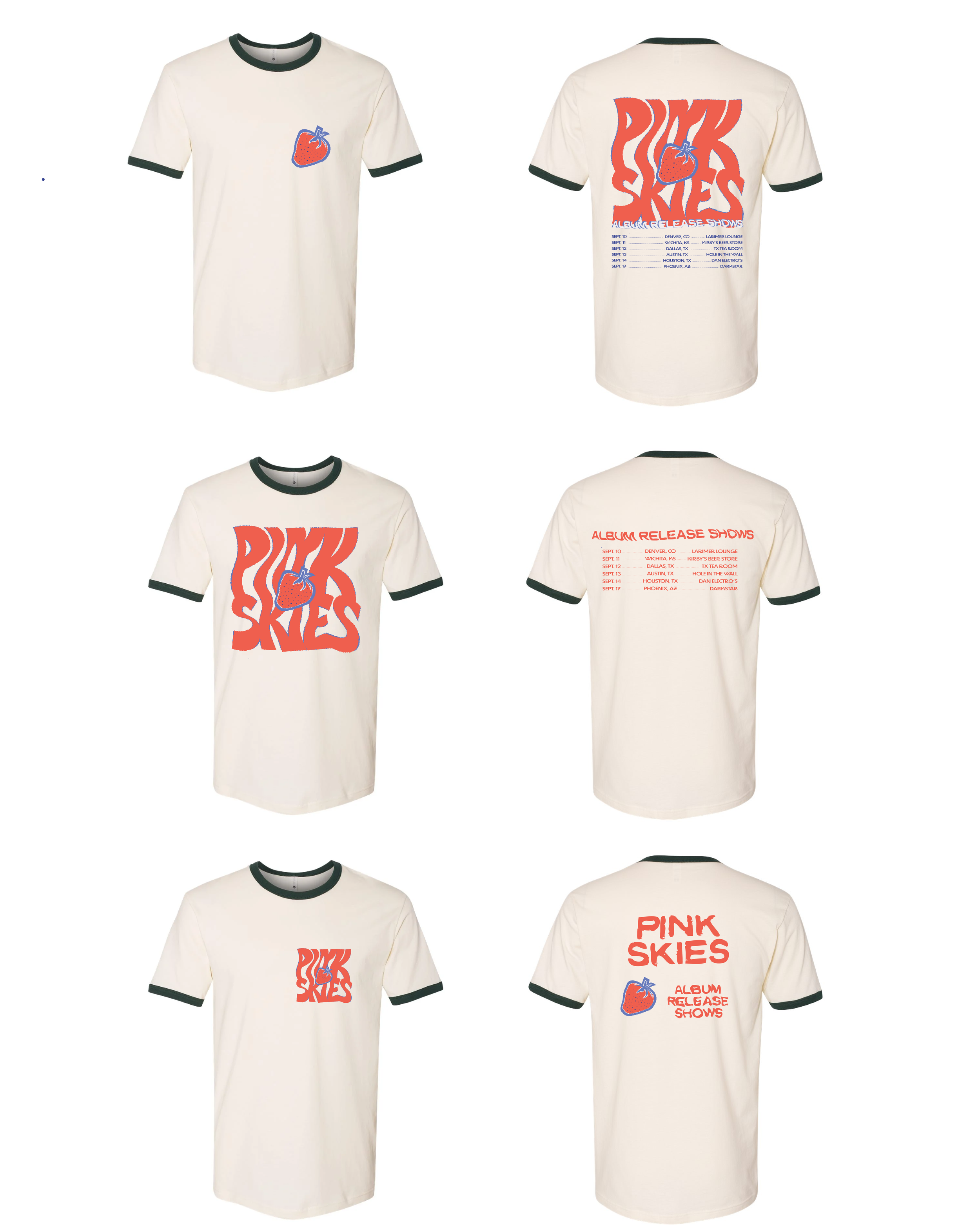
final t-shirt design